Tools:
Webflow
Xd
Illustrator
Photoshop
After Effects
GSAP
Tasks:
Design
Development
Goals:
Creating a clean portfolio with distinguishable features
Finding a source of these features inside the brand story
Looking for rareness inside the portfolio cannon
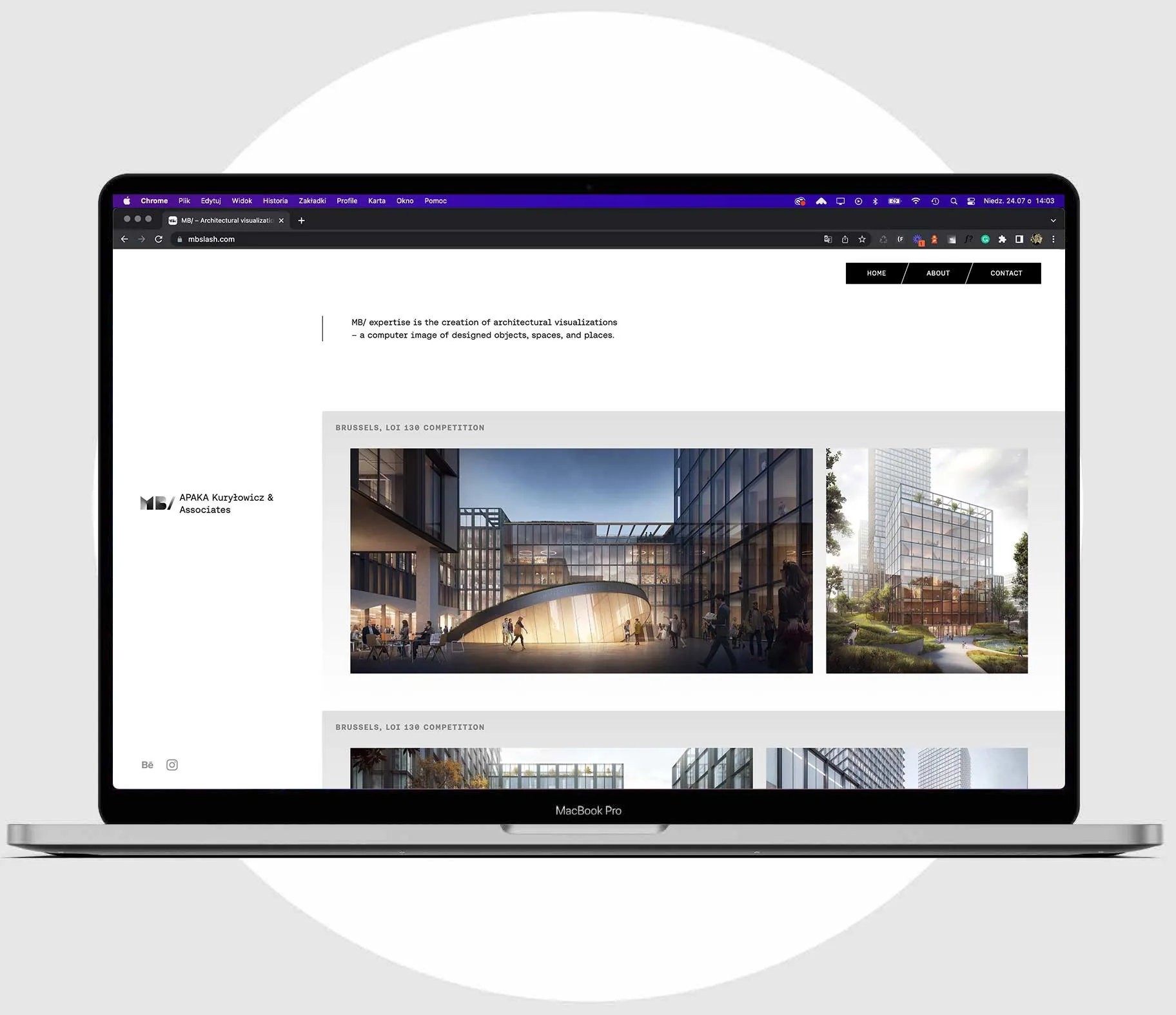
MB/ slash is a studio creating 3d images of spaces. We were approached with the task of creating a clean portfolio that would offer an alteration on organizing the image gallery from the websites of the competitors. For this, we found the answer in the brand’s name origin – MB/ is always a half of each project, the other half are their clients: real estate developers and architects' studios – so there is always a different company name that comes after the slash.
This brand story led to grouping the MB/ images by each client, putting part of the portfolio emphasis on the studio collaborative approach. The site concept organically activated the company logotype, animating it, and using its different versions.
Testing the limits
The whole portfolio is based on a single Webflow CMS database inside of which we worked with possibilities of the most effective display of different numbers of images in different aspect ratios inside repeated pieces of the layout.
