


Tools:
Webflow
Xd
Illustrator
Photoshop
Tasks:
Wireframing
Information architecture
Design
Development
Goals:
Clear photography
presentation
Extending attention time
paid to the photos
Introducing an option
to buy a print
goals
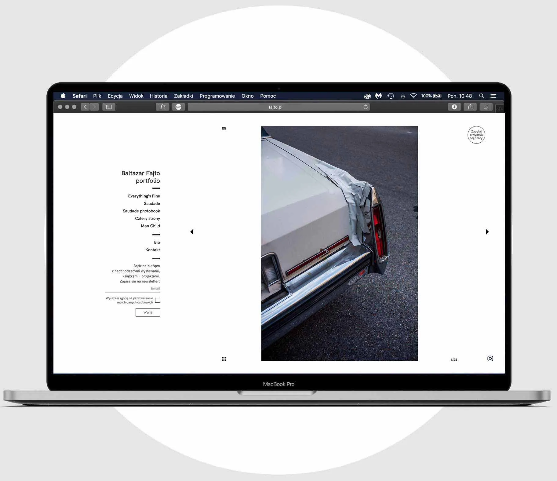
Redesign of my photographic portfolio site. The new design came from the need to meet few objectives: to hold users’ attention on the content for longer, to create more intuitive navigation, to signal an option to buy a print, and to create the newsletter audience.
PROJECT STARTING POINTS
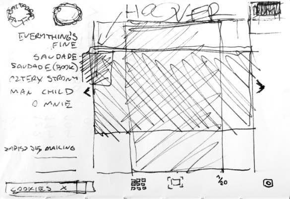
To break up with the common, automatic, and inattentive reflex of scrolling through the pictures on the web, I decided to resign from scroll entirely and fit whole content above the fold, mostly in the clickable slider.
A repeated mistake I saw in the portfolios of similar type is an unintentional accentuation of some images through scaling them to the maximum size possible – on the desktops horizontal pictures get more width than vertical only because they can. That’s why I decided to inscribe all images in a square, making all longer sides of the pictures uniform, regardless if they were horizontally or vertically oriented. White cube aesthetic (black and white only, clean neogrotesk font) was used to help to position presented photography in the art context, and allow to focus on the image with no distractions.
Results
The site has met its goals – in comparison to the previous one average time spent on the site has extended sixfold, and the rejection rate dropped four times.