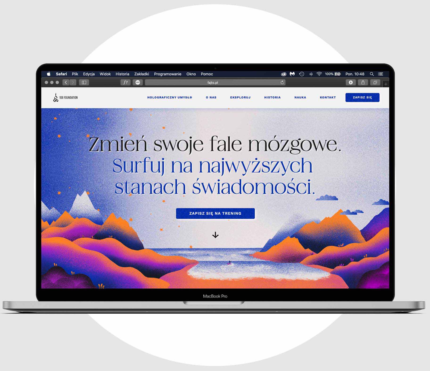
108 Foundation
Tools:
Webflow
Xd
Illustrator
Photoshop
Tasks:
Creating personas
Information architecture
Design
Development
Content optimalisation
Goals:
Sign up for training option
Increasing knowledge about the service
Introducing abstract information in a friendly way
Foundation scope
The 108 Foundation conducts EEG based training that increases participants’ control over their brainwaves. Some of the training benefits are increased creativity, better focus, improved mood.
brief
Brief underlined the need to present the Foundation as a professional instance, trustworthy, but free from the ‘weight’ of a distanced institution. Creating detailed tasks for the project was worked out in a joint reflection about the site’s possible functions. Then we decided on primary and secondary actions.
users
We proposed to establish a relationship with users through the usage of custom illustrations that will help to understand and connect with the abstract concepts of the Foundation activities. That way was also great for avoiding the threat of using visual clichés associated with self-development.
In effect, we started a cooperation with an illustrator Magda Wilk, who prepared drawings in given places of wireframe and based on site colours.
Information optimalisation
A big challenge of the project was to develop content that was delivered by the Foundation – in its initial version it was almost continuous text resembling academic books. Based on the knowledge about users’ behaviors on the web and the role of proper information structure in carrying out site tasks we were able to cut most of the information load into smaller ‘bites’. Some of them were represented with numbers, others were moved into separate tabs on the site, intended for more inquisitive users.
After being published Foundation’s site serves also as an origin of the brand identity.