Tools:
Webflow
Figma
GSAP
Tasks:
Information architecture
Design
Development
Goals:
Display current and upcoming gallery events, ensuring that visitors can quickly find information about what is happening in the gallery
Having a content management system with a flexible and interconnected structure
Website design for a brand-new art gallery
Aspekty Gallery in Warsaw promotes Polish contemporary art, presenting both avant-garde classics and contemporary artists through hosting shows, meetings, and workshops.
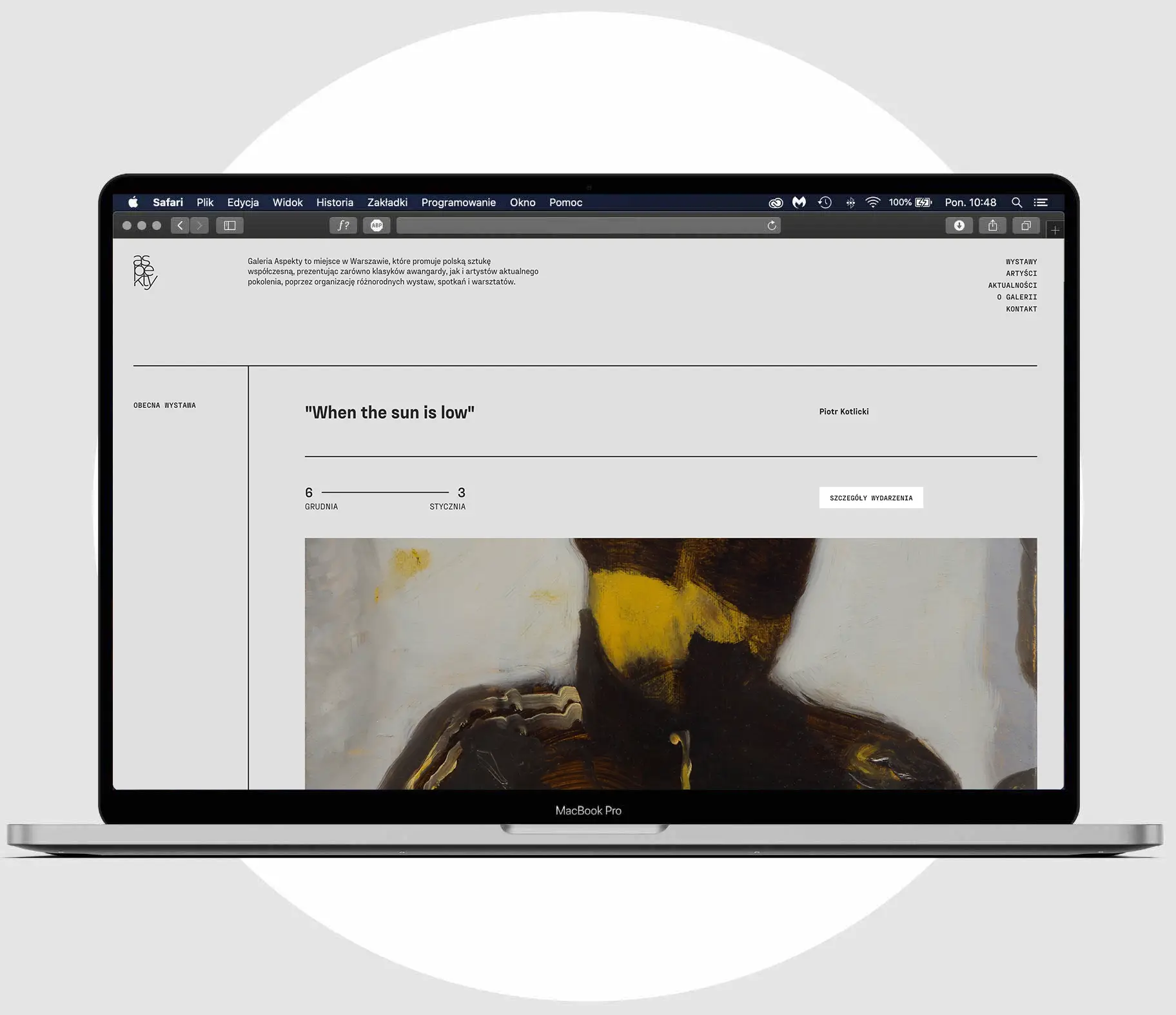
As a new spot on the local art map, the gallery needed a website that would be flexible enough to conveniently present different types of activities and allow a harmonious look when presenting different types of artworks. It was also crucial that users will quickly find info about current and upcoming events.
Elastic CMS structure
Almost all of the site content comes from the CMS, so creating a rigid structure that will contain many types of future content was crucial. Working with a new entity allowed to build an elastic and interconnected CMS structure from the ground up, making use of many great features of Webflow CMS and custom JavaScript solutions. Gallery could fill in the information in dedicated collections for artists, shows, news, and artworks and then connect that data to each other.
As most gallery activities are tied to a timeline, it was critical that the site that the content would be auto-adjusting as time passes and be displayed in different parts of the website. For example, the same exhibition could be displayed in the announcement sections, featured on the homepage hero section, or in the archive – depending if its dates are in the future, present, or past.
At the end of the work, the staff was introduced to the CMS with in-person training.
Exposing artwork and architecture
The website interface is achromatic, leaving color only for the artwork's reproductions and photos. Layout intentionally exposes the site’s construction with horizontal lines designating sections and vertical lines grouping section content. This disciplined concept was completed by adding technical flavor with the PP Fraktion typeface.
