


Tools:
Webflow
Figma
Blender
GSAP
Adobe CC
Mapbox
Tasks:
Key visual and logo
Web design
Development
Goals:
Creating new look for the festival comeback
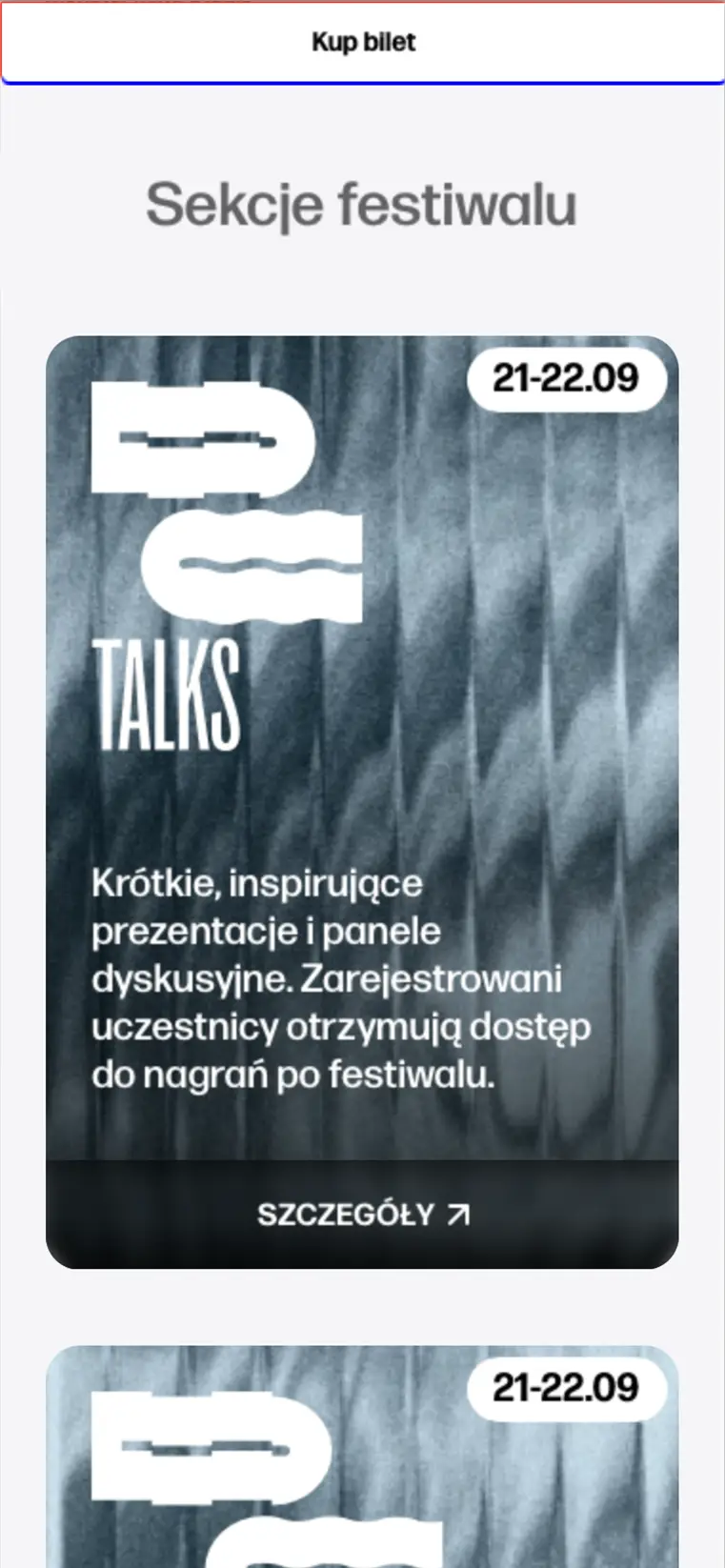
Website structure allowing for easy programme browsing
Brand Identity for Digital Cultures Festival
Digital Cultures is a festival dedicated to audiovisual culture, focusing on topics related to digital art. We created an identity for its 2024 return after a few years' break.
Its audience consists of people well-versed in contemporary culture, artists, game designers, and creators of immersive experiences. This year’s theme of the Festival, ‘Seamless Technologies’, relates to the alteration of humans’ perception through the progress of increasingly elusive technology.
Logotype for the Fesitval
During our collaboration with the Festival curator, it became clear that the brand should focus on the interplay between technology and humanity. This led us to create a versatile logotype that reflects the festival’s broad scope and will remain relevant for years to come.
Its character is derived from the juxtaposition of two worlds, represented by different appearances of analogous and digital signals (angular vs flowing lines). The extended letterform of the "DC" acronym was paired with a narrow type to create visual contrast and enable different ways of composing the mark.
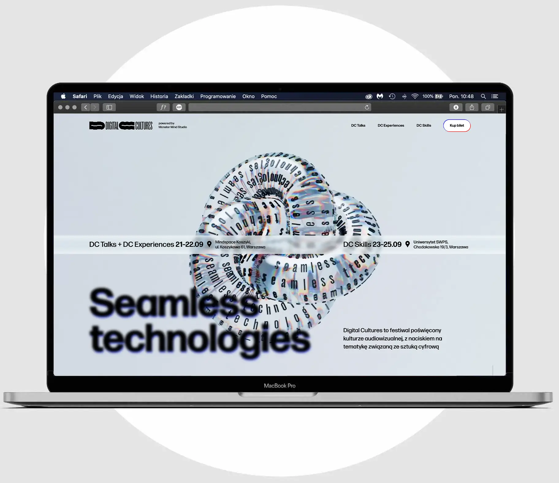
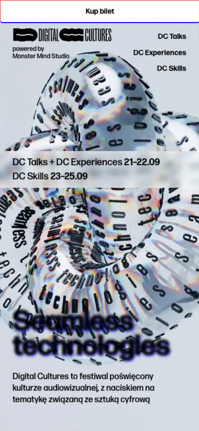
Key visual and website for the event
The identity for this edition stems from thinking about representing the theme of ‘Seamless technologies’. The process of looking through the technology at the world but not seeing it itself led us to pick the concept of transparency.
In the direct meaning of transparency, we used glass layers to create the main key visual, the glass Ouroboros. To complement this, we used blurred and diffracted graphics to further emphasize the undetectability of tech.
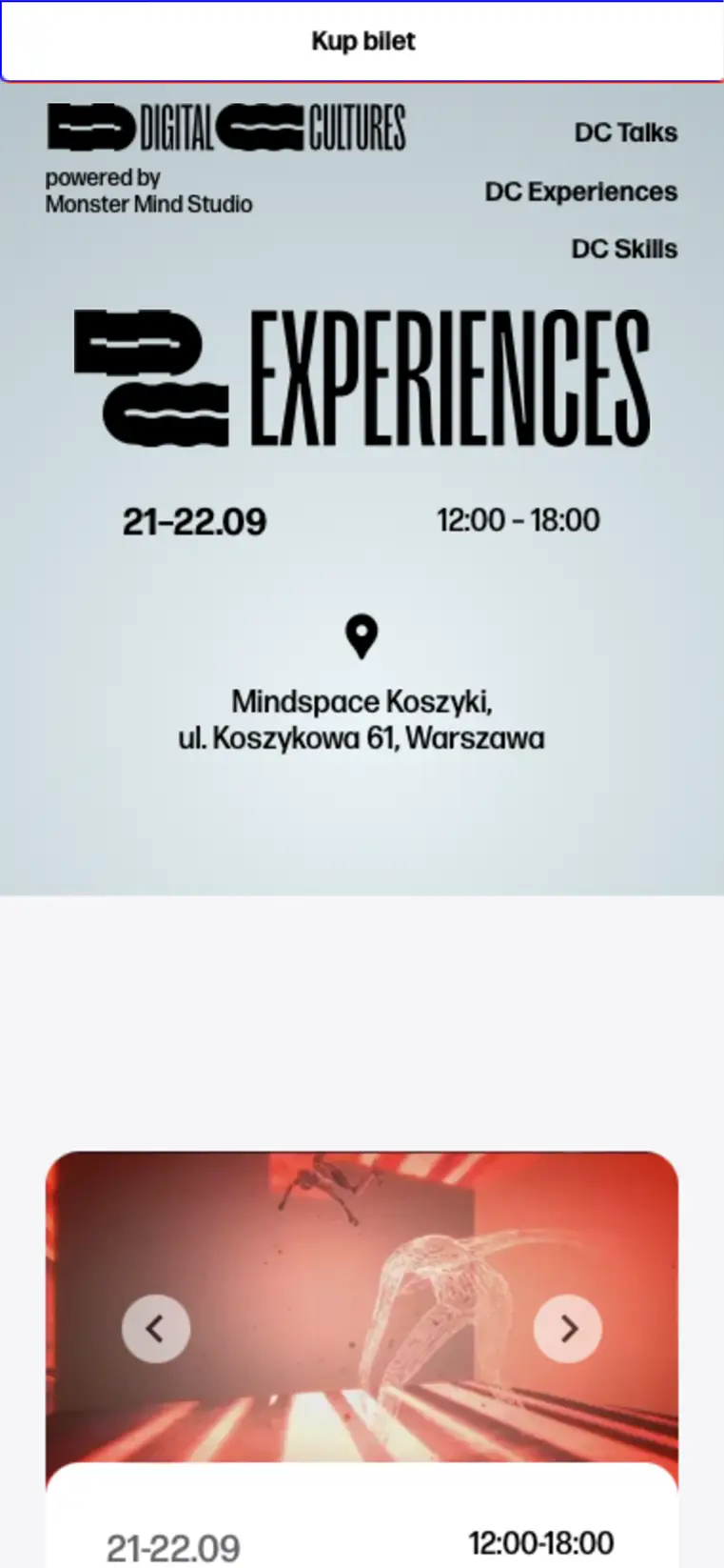
In more indirect meaning the concept of transparency was handy when we were thinking about the website layout. We were looking for website designs that perfectly reflect the 2024 zeitgeist. For us, this benchmark was the Apple website – solid, in-the-now tech without nostalgia for the past but also without leaning into futurism. To this foundation, we added festival-characteristic visual elements.